Posts in Colour
Pantone Color of the Year 2023
 

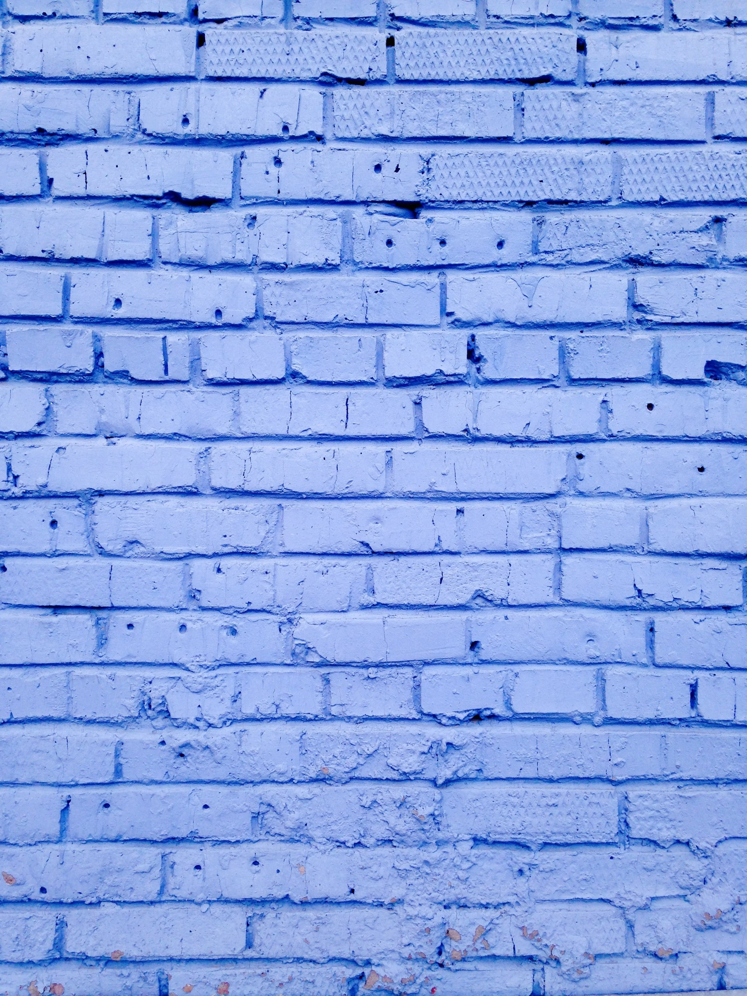
Photo by Ryan Stone on Unsplash


It’s the most wonderful time of the year! Because of the holiday season? Maybe. But in the design worlds it is the announcement of the Pantone Color of the Year that brings excitement to December.

Pantone is the world’s leading expert in colour and has been presenting the Color of the Year for over 20 years, influencing design decisions in colour conscious industries such as textiles, apparel, as well as interior, architectural and industrial design.

Last year, for the first time in Pantone’s history, the Color of the Year was a new creation: PANTONE 17-3938 Very Peri. This year it’s another new colour, representing empowerment, courage and experimentation: PANTONE 18-1750 Viva Magenta.

In this age of technology, we look to draw inspiration from nature and what is real. PANTONE 18-1750 Viva Magenta descends from the red family, and is inspired by the red of cochineal, one of the most precious dyes belonging to the natural dye family as well as one of the strongest and brightest the world has known.

Rooted in the primordial, PANTONE 18-1750 Viva Magenta reconnects us to original matter. Invoking the forces of nature, PANTONE 18-1750 Viva Magenta galvanizes our spirit, helping us to build our inner strength.
— Leatrice Eiseman, Executive Director of the Pantone Color Institute

Viva Magenta is a crimson red tone that strikes a balance between warm and cool. Being a hybrid colour, it “comfortably straddles the physical and virtual in our multi-dimensional world.” This colour creates an electrifying statement that “revels in pure joy, encouraging experimentation and self expression without restraint.” This red tone is bold and has the power to influence positivity in the worlds of design.


Since Viva Magenta was only announced this month, it may be a while before you start to see the colour in consumer products but it will emerge in fashion, textiles, technology and beyond. You can welcome this fearless colour into your home by creating unusual colour combinations in textiles, adding bold paint in subtle places or by picking textures and finishes that incorporate the concept of Viva Magenta, adding an element of strength and positivity to your space.

And after the last couple of year we’ve all had, who wouldn’t want that? Viva Magenta!

Considering Colour
 

ROYGBIV Exhibit, Art Gallery of Alberta September 2021 - January 2022


The ROYGBIV exhibit at the Art Gallery of Alberta (“AGA”) ended at the beginning of 2022. If you managed to attend the AGA during its’ run from September 2021 to January 2022, you know that projects in the exhibit helped to “reveal a relationship between colour, architectural form, the inner and outer spaces they can create and the resulting effects on the human body.”


ROYGBIV featured artists who like to work with colour and through their installations, explore how mood, behaviour and even physical space is affected by it. Artists like Kapwani Kiwanga and Witthöft & Latourelle celebrate colour while causing us to reflect on the way we change when confronted by it. The tactile exhibit by Shoplifter allowed interaction and exploration through texture, various colour combinations and physical space.

But the one part of the whole show that really stood out was the short film entitled “Dammi i colori” by Anri Sala, a contemporary Albanian artist whose main medium is video. His installation reflects on the transformation of Tirana in 2003 through the use of colour on building facades. The film includes footage with Tirana's mayor at the time, Edi Rama, a close friend of Sala’s and the main force behind the city’s transformation.

Hyperlings by Shoplifter
ROYGBIV Exhibit at the Art Gallery of Alberta September 2021 - January 2022


The film is full of contrasts: the brightly painted buildings against the background of a war torn city; the daylight leading into the darkness; dispair vs. optimism, silence vs. conversation - all inviting the viewer to reflect on the success of the project and to draw attention to that idea of hope in a place where there seemingly isn’t any; all through the application of colour to architecture.

It also forces the viewer to reflect on their own surroundings and how colour impacts the way one not only interacts (inside and out) with buildings and public spaces but with each other. It begins to form the question of how collectively, colour contributes to the overall ‘feel’ of a city. And maybe the role of colour in architecture overall.

That has been a controversial subject in the architectural world. Some think it’s not an important part of the design strategy, others think it’s vital. Based on basic colour theory, the “right” colours can summon emotional responses that create a positive connection between the space and the human.


Photo by Hergi Lici on Unsplash

 
Colour has a tremendous influence on our moods and cannot be too carefully considered.
— Frank Lloyd Wright

This exhibit proved just that. By integrating colour into building design, it can aesthetically enhance while accurately conveying purpose and function. It just has to be cleverly applied.

What are your thoughts on the application of colour in architecture?

Pantone Color of the Year 2022


December is usually regarded as ‘the most wonderful time of the year’ mostly because of the holiday season. But in the design worlds it’s because Pantone - the world’s leading expert in colour - announces their Color of the Year. This has been a tradition for over 20 years and influences design decisions in colour conscious industries such as textiles, apparel, as well as interior, architectural and industrial design.

Last year’s Color of the Year was a combination: Ultimate Gray and Illuminating. This year for the first time in their history, Pantone has introduced a completely new colour: PANTONE 17-3938 Very Peri.

As we move into a world of unprecedented change, the selection of PANTONE 17-3938 Very Peri brings a novel perspective and vision of the trusted and beloved blue color family, encompassing the qualities of the blues, yet at the same time with its violet red undertone, PANTONE 17-3938 Very Peri displays a spritely, joyous attitude and dynamic presence that encourages courageous creativity and imaginative expressions.
— Leatrice Eiseman, Executive Director of the Pantone Color Institute

According to Eiseman, the creation of Very Peri is a reflection of the “global innovation and transformation taking place. As society continues to recognize color as a critical form of communication, and a way to express and affect ideas and emotions and engage and connect, the complexity of this new red violet infused blue highlights the expansive possibilities that lay before us”.

With a “carefree confidence” and a “daring curiosity” that invigorates the creative spirit, Very Peri helps us to “embrace the altered landscape of possibilities”, giving us a hopeful look of the future. Very Peri keeps us intrigued and works well on its own but also works harmoniously amongst Color Palettes that embrace warm and cool tones, are nature-inspired, combine classics and neutrals or display a whimsical story of fun and spontaneity.

This could mean incorporating more playfulness in our homes: unusual colour combinations, a bold accent wall, brilliant colours in textures and finishes. The blue tone of Very Peri reminds us of the sincere qualities of blue while the violet red undertone shows us the charismatic quality of red. The Color of the Year 2022, Very Peri adds a pop where needed and will help brighten a space in whatever function, with its dynamic and joyous attitude.